N E W F O R M A L I S M | IDEA TWO: SWEETS
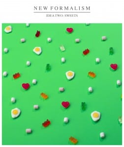
This image has been influenced by both Andrew B Myers, and Josh Dickinson; photographers who both use objects of similar origins, to make patterns on colourful backgrounds. Their work varies from grid patterns to random patterns.
I chose to use sweets due to their small size, but varied textures. The light will either reflect and shine off the gummy surfaces, or get trapped in various minute crevices of the mallow. This creates interesting shadows within this image, making it hard to focus on just one area of the image, its always the person viewing the image to engage with all elements. Another reason why I chose these sweets are due to the nostalgia people will get when viewing the image, almost being able to taste and smell the image whilst viewing due to the popularity of the sweets.
The green background is harsh on the eye, due to its sharp colour and helping create a contrast with most of the sweets, making the colours of the image bolder and brighter. This helps create an artificial feel to the image; something which both photographers do well to create their images.
I chose this camera angle, as it created better shadows with the sweets, and also gave the feel that they’re clinging on to the background, giving a depth to the image. Also it added a variety to the sweets, creating more unique shapes within the image.
On the other hand, I would have preferred to make a grid pattern, as I feel the random lay out of the sweets creates a cluttered feel to the images, where as a grid pattern would be a lot more formal, and to a style I prefer.
