N E W F O R M A L I S M | IDEA THREE: PINS
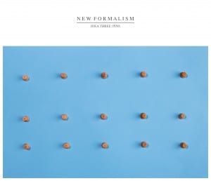
This image is also influenced by Andrew B Myers, as one of his projects he uses pins (http://www.andrewbmyers.com pg.5) and created interesting shadows within the pin patterns. This influenced me to take a similar approach with the pins, but I wanted to created smaller and more varied patterns with the shadows. I succeeded with this by using various different lighting, to create such interesting shadows. Overall I wanted to create something that is very minimal, but also complex, by having an ordered pattern, but adjusting various elements to create a small amount of disorder in the image, making each pin look different in the image, giving the viewer a more interesting image to look at.
I chose the blue background as it contrasts well with the wooden pins, creating a more artificial looking image overall, due to the strong contrast in colour and texture. In a way, the style of this image is also some what influenced by the film “Toy Story”, and these colours and textures are similar to in “Andy’s” room. This can give a sort of nostalgic feel to the image, and also has a slight animated style to it.
I chose to shoot the image straight on as that was the best way to get the various shadows within the order of the pins. This also gives a more minimalist style to the image, as it creates more subtle changes within the image. Also, the main focus was on the top of the pins, giving a slight depth to the pins, making them stand out more from the background, which would only be achieved from this angle.
Overall I think I’ve created a successful image, in the way and style that I wanted to achieve. On the other hand, I would have liked to create a more grid like image, to see how the image would look if all pins were equal and in line with each other, and with the same shadow, to create an even more artificial looking image, reducing the diversity of the image.
